Basic tips to create responsive websites
In the past few years, the use of smartphones has grown rapidly. Back in 2014, only 22% turned to their phone first to browse the internet. For 2019, it is expected that mobile phones will be used for 80% of internet access, reports Quartz. In order for us to keep up with the ever-changing digital world, we need to adapt and make sure we’re offering our audience an optimal user experience. This is where responsive design comes into play. It is now more important than ever to focus on responsiveness and to ensure that our websites can be accessed from a variety of devices.
Useful Tips
Here are some simple but very effective tips for building a responsive website:
1. Use rem (Relative to the font-size of the root element).
The default font-size for the browser is 16px, so 1rem=16px. In order to easily use rem, we can modify 1rem to be equal to 10px and then make the following computations:
X / 100 * 16px = 10px => X = 62.5 => if we want 1rem to be equal to 10px, then we have to set the font-size on our site to be 62.5% of the default font-size. (This technique will work if the user changes the default font-size for the browser too).
To make it responsive, I decided that on tablets I want 1rem=9px and on mobile 1rem=8px; it will end up looking like this:
html {
 font-size: 62.5%; // 1rem = 10px

 @include breakpoint(medium) {
   font-size: 56.25%;  // 1rem = 9px
 }

 @include breakpoint(small) {
   font-size: 50%;  // 1rem = 8px
 }
}
Note: we will discuss about breakpoints in the next section (2).
How is this actually working?
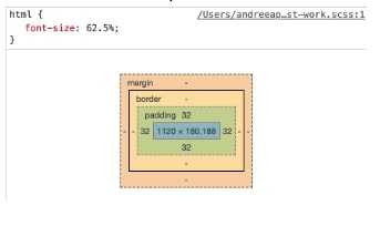
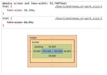
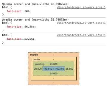
Let’s set a 3.2rem padding on one div.
- On larger screens we have 3.2rem=32px:
- On medium screens, we have 3.2rem=28.8px:
- On small screens, we have 3.2rem=25.6px:
As we can see, by using rem we already managed to create responsiveness.You can use rem for height, width, font-size, padding, margin and so on.
Note: do not use rems for elements that have fixed dimensions (like 1px borders etc).
Source: https://www.udemy.com/advanced-css-and-sass/
2. Use breakpoints.
Sometimes the difference we obtain using rem is not enough. In that case, we must use breakpoints.
For example, for the page padding we want 64px on desktop, 36px on tablets and 24px on mobile. (Remember that on tablets, 1rem=9px and on mobile 1rem=8px)
We will end up with something like this:
.responsive-page {
 padding: 6.4rem; // 6.4 * 10 = 64px

 @include breakpoint(medium) {
   padding: 4rem; // 4 * 9 = 36px
 }

 @include breakpoint(small) {
   padding: 3rem; // 3 * 8 = 24px
 }
}
You can either create your own breakpoints system, or you can just use an existent one. I used https://foundation.zurb.com/sites/docs/media-queries.html and just changed the default direction (up with down).
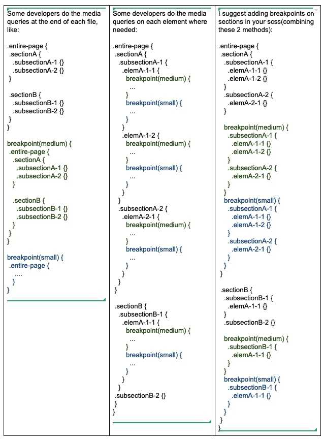
Tips for organising your scss (in order to keep it maintainable):
3. Use flex-box.
Establish from the begging a structure for your page that uses flex-box (another good option would be grid, but not all the browsers support it). Flex-box is the easiest way to make layout changes on your page.
Usually desktop layout differs from mobile layout.
For example, on desktop we can have row-aligned elements (like 4 elements having the same width on one single row), while on mobile we can have column-aligned elements (4 rows with one single element on each row).
Desktop(Default):
display: flex;In order to create equal width for the 4 elements, we can use flex: 1.
Desktop Item:
flex: 1;Flex allows us to make the change for mobile by changing only one line.
Mobile:
@include breakpoint(small) {
flex-direction: column;
}
You could also use flex-wrap and change the width of the items in order to create the same layout. Flex-wrap will automatically move items on the following row if they do not fit on one single row and will make it look like a column. This approach requires to set the width on your elements (in order to implement the 4 elements example from above).
Desktop Item(Default):
width: 25%;Mobile Item:
@include breakpoint(small) {
width: 100%;
}
Another situation in which you might want to use flex wrap is when you have to deal with more complex layouts (e.g. when one element does not have to occupy the entire row). . For example, you could have something like:
If your list of elements is a dynamic list and you are not sure about the number of elements, I would suggest using flex: 1 instead of setting the width. In this situation the first method would work better.
If your list of elements is a dynamic list but you are not sure that the elements will fit on one row on desktop, you should consider using flex-wrap.
4. Use responsive images.
Another important thing to consider is that the image resolution must be adjusted according to the screen type. We also have to keep in mind that on small screens the image dimension has to be set correctly in order to avoid unnecessary use of bytes. The size could have a significant impact on page load speed and performance in general, so keeping your images lighter will definitely improve that as well.
Here’s a good trick to achieve that using srcset property:
<img srcset="img/image-1x.png 1x, img/image-2x.png 2x" alt="Responsive image">or
<img srcset="img/image-1.jpg 300w, img/image-1-large.jpg 1000w"
sizes="(max-width: 900px) 20vw, (max-width: 600px) 30vw, 300px">Where w indicates the width of the images in pixels
Another good idea would be to use lazy load images, to improve the performance of your site. But that is a subject for another topic.
5. Set width (or max-width) for elements that could overflow the
screen, like images.
For example, if you want to set a responsive banner on your page, it’s enough to set width: 100% on your image style and the image will keep its ratio regardless of the screen resolution of your device.
6. Take care of the elements that differ from one screen type to
another.
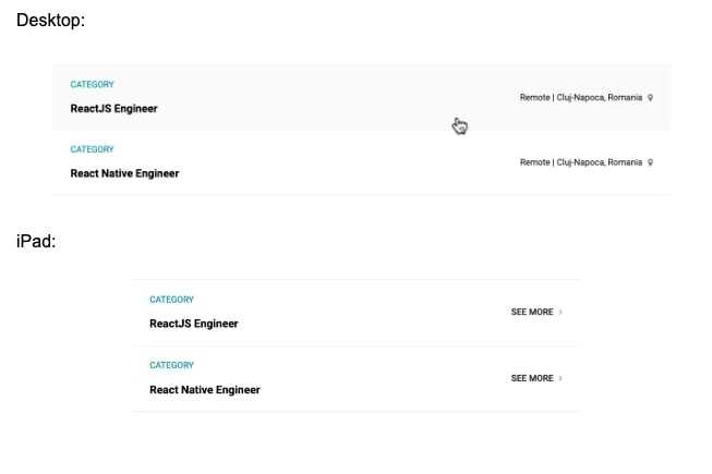
For example, the hover behaviour only applies to some types of devices. This means that we need to find a way to show the user that they can interact with a hoverable element on tablet and mobile, as shown below:
Final Thoughts
The most recent effort by Google to further improve mobile web experience is implementing mobile-first indexing strategies. Mobile-first indexing bases ranking and indexing from the mobile version of a site, as opposed to the desktop version.
Last tip: You can test your website on https://sizzy.co/ :) .
These are the most basic elements that can help you build a responsive website. There’s definitely a lot more to take into consideration and your approach might end up differing based on project specifications. Keep these in mind and you will make your life easier when implementing stunning responsive designs!
Source: https://digitalnext.co.uk/dn-hub/blog/importance-of-responsive-web-design/
