Build Native Cross-Platform Apps with Flutter
“Flutter is Google’s UI toolkit for building beautiful, natively compiled applications for mobile, web, and desktop from a single codebase.” - flutter.dev/.
Basically, you kill two birds with one stone—actually, a whole flock of birds.
Flutter is an awesome SDK that comes with a comprehensive documentation and a myriad of libraries and tools that can be found here: api.flutter.dev. For even more packages check out pub.dev/packages. Thanks to Flutter’s rich library of widgets, there’s something out there for every developer.
Now let’s get down to the nitty-gritty. The thing about Flutter is that the good and the bad are sides of the same coin. Here’s what I mean:
🙂 The thing about Flutter is that it has so many items that you can pick from.
🙃 The thing about Flutter is that it has too many items that you can pick from.
You will need to get acquainted with a lot of widgets; with so many great options out there, how do you decide which ones to choose?
Layout
- Scaffold: the basic material design visual layout structure
- provides APIs for showing drawers, snack bars, and bottom sheets
- main props: appBar and body - LayoutBuilder: useful when the parent constrains the child's size and doesn't depend on the child's intrinsic size
- Container (if height and width are not specified, it will match its child’s size):
- main styling props:
- margin
- padding (Can also be achieved with Padding class)
- constraints: (Can also be achieved with ConstrainedBox class)
- decoration: BoxDecoration main props: border (Border; you can be use BorderSide for each particular border side), borderRadius (BorderRadius), shape, image, boxShadow
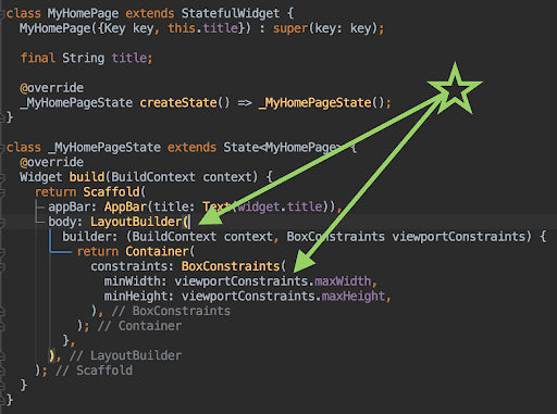
In most cases you want your app to fit the entire available space on the screen; use LayoutBuilder and Container: constraints at the very top level.
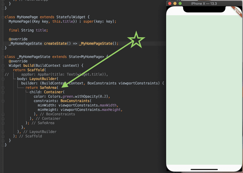
- SafeArea: adds padding to avoid intrusions by the operating system (for example, The Notch on the iPhone X)
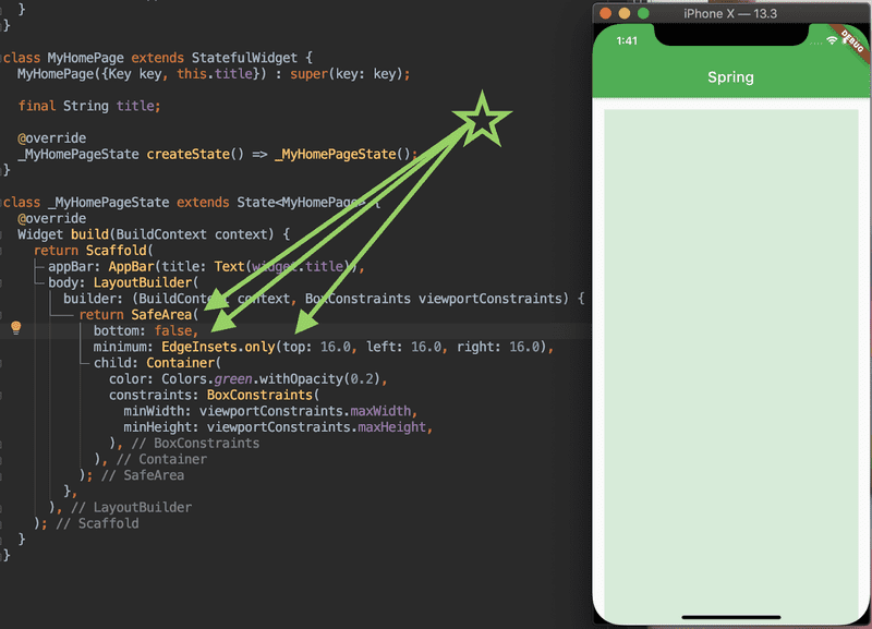
Next you want to make sure that your content is not affected by any intrusions with SafeArea:
Note: If you are going to have Scrollable Views in the app, I strongly recommend setting: “bottom: false” (and avoid setting padding for the bottom side):
Be careful when you template your app! Flutter does not support negative margins, so setting a padding that is too big on your top levels might cause some difficulties later.
You could also check the steps from https://mcro.tech/react-native-templates; they can be adapted and applied for templating your app.
- SingleChildScrollView: when you have a single box that will normally be entirely visible
- ListView: most commonly used scrolling widget
- SizedBox: mostly used to create empty spaces
Alignment
- Row: renders its children in a horizontal array (equivalent of “flex-direction: row“)
- Column: renders its children in a vertical array (equivalent of “flex-direction: column”)
- Wrap: works like a Row or Column, but takes care of your items if they don’t fit
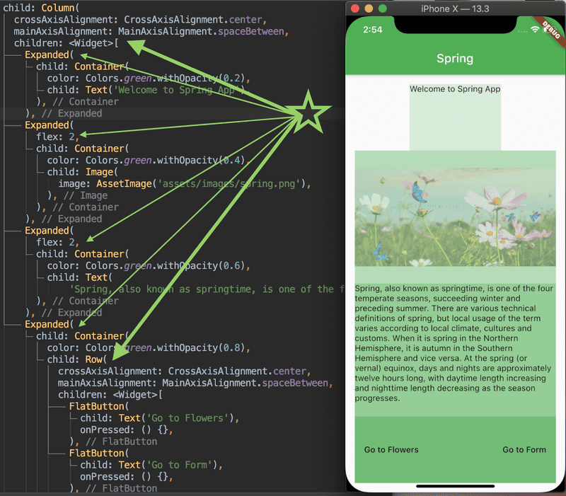
- Expanded: used to make a child of a Row/Column/Flex to expand; you can set flex property - only integer values
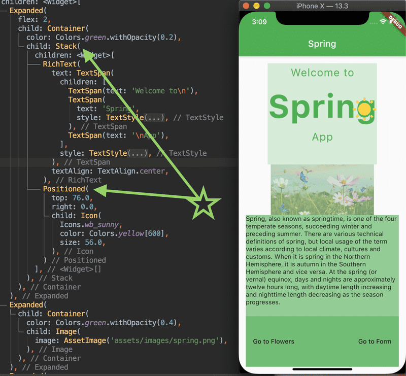
- Stack and Positioned: if you want to overlap several children in a simple way
- "justify-content” turns into mainAxisAlignment property
- “align-items” turns into crossAxisAlignment property
- “position: absolute”: you have to wrap a Position widget inside a Stack widget:
Styling Content
When it comes to content, there is no shortage of widgets. What’s more is that they are easy to find, as they are named according to their functionality: Text, FlatButton, FloatingActionButton (cool button that floats!), Form, TextFormField, TextField, Image, Icon, Radio and Checkbox, just to name a few.
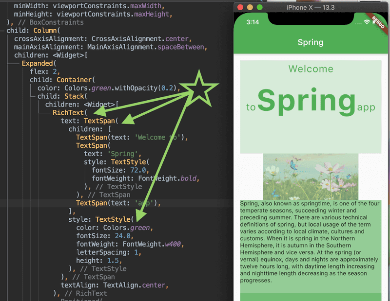
- RichText and TextSpan: to add different styles to some pieces inside your text.
If you come from web development, you probably know that sometimes you want to add multiple styles to the same line of text, and that you can easily do that with divs and classes or styled components (there are many ways to do it).
Here’s how you can do it in Flutter:
- Customizable/Expandable styles: re-use your declared styles without issues with copyWith method.
Flutter code can become pretty hard to read, especially if you have to add many style properties on many widgets.
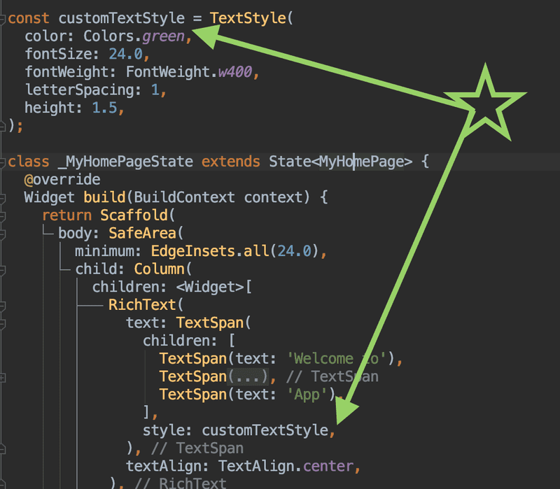
I feel like this is the most important tip and it is so easy to apply!
Declare your styles separately, in a reusable way:
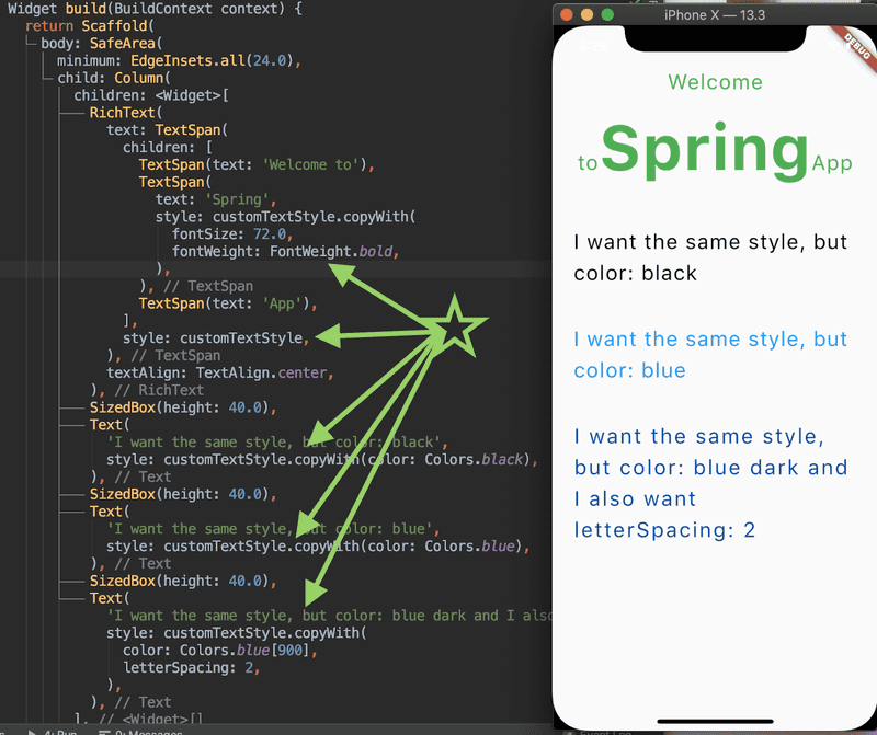
What would you do if you wanted to reuse your declared style, but only needed to change a few properties? This can simply be achieved using yourStyle.copyWith (properties to change):
You just have to find the proper style type to apply copyWith (e.g.: TextStyle, TextTheme, InputDecoration, IconThemeData, ThemeData, TabBarTheme etc).
- Fill the available space: use width: double.infinity to occupy all the available space
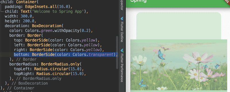
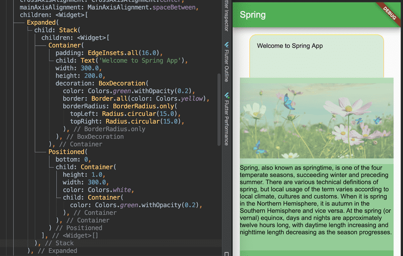
- Borders: You can not have bordersRadius and different styles for border sides at the same time.
Let’s say you want yellow borders, but you don’t want the bottom border to be displayed:
Borders are not rendered (+ child is not rendered, because Flutter throws an error):
Borders are rendered only when border style is same for all sides:
I would use “margin: -1.0”, but is not a valid solution (maybe you missed this is the beginning of the article: Flutter does not support negative margins).
Instead, this approach (using Stack & Positioned) should do the trick:
Conclusion
Flutter is easy to use, and as I mentioned in the introduction, it is extremely well documented—even if it’s just “a toddler” (it was released in May 2017).
Perhaps styling your app by using specific widgets instead of CSS properties doesn’t feel straightforward, but it is a safe way to avoid overwriting style properties. Plus, it makes structuring your app much easier.
