Neumorphism in User Interface Design
Introduction
Neumorphism is a new design trend that may become a future standard. The term comes from "new skeuomorphism". Skeuomorphism is the process of emulating real-world objects in UI design, like the trash bin icon from macOS or the diskette save icon from Windows. Neumorphism is based on this concept and expands it with the use of an ingenious addition that changes everything.
What is Different
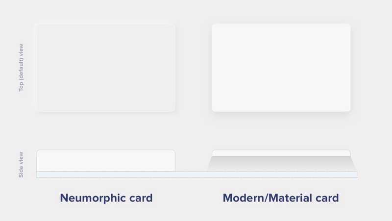
Common modern UI elements and components, such as material ones are floating surfaces. They are highlighted by appearing on top of the design background and they cast a shadow on it, thus giving the sensation of floating.
On the other hand, neumorphic elements do not appear to float; instead, they give the impression of surfacing out of the background. This is possible because of two reasons:
Firstly, the main principle behind neumorphism is that the background color must be the same as the element color.
Secondly, to make the elements appear as they are extensions of the background, the highlighting part is done by using a simple, but subtle effect. Each UI element has two shadows projected onto it, a light shadow on its upper-left corner and one dark shadow on its bottom-right corner. This gives the impression that the light source is located somewhere in the top-left part of the screen and casts a shadow on the lower right part.
 https://uxdesign.cc/neumorphism-in-user-interfaces-b47cef3bf3a6
Guidelines
In order to design a neumorphic user interface, certain rules must be followed. In order to do so, a main color must be selected, which will provide a base for the entire palette. In order to create a monochromatic scheme, we want the other shades to derive from this main color. The result will be comprised of a base color along with its lighter and darker shades representing different level of shadows. A quick example will be provided below, by solely using HTML and CSS.
Accessibility
Neumorphism might seem futuristic, but although it works well in some instances (e.g. card design), it has some major drawbacks when it comes to accessibility.
User interfaces should be accessible to people with disabilities, regardless of the platform. People with auditory, cognitive, neurological, physical, speech and visual afflictions should be able to use any given application with as little assistance as possible. Neumorphism lacks support for people with cognitive and visual disabilities, as we will see next.
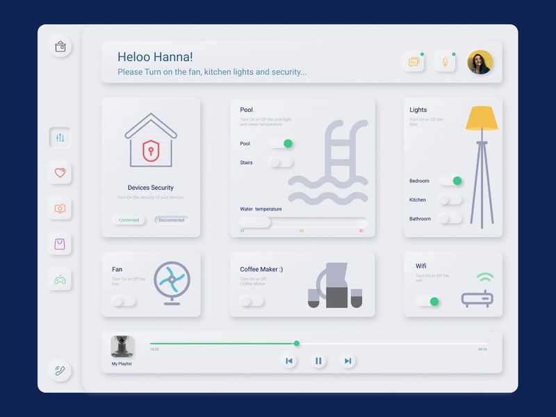
Neumorphic interfaces are monochromatic and lack in contrast, relying mainly on the use of shadows to emphasize elements. What this leads to is a lack of visual hierarchy and focal points. Since cognitive disabilities impact how people process information — mainly their perception, memory, and attention — this design approach could result in confusing and hard to use digital products.
A good user experience is one that doesn’t make users think, one that guides their eyes through the content. The subtle contrast that characterizes neumorphic design makes it hard for users to perceive hierarchy. User interfaces should be straightforward and intuitive.
 https://dribbble.com/shots/9592062-Neumorphism-Smart-Home
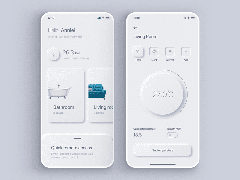
Moreover, neumorphism is also unsuitable in regard to vision loss, blindness or color blindness. A high contrast between the text and its background ensures good readability. In the case of neumorphic interfaces, the elements almost blend in with the background, disregarding contrast ratio. Another important aspect to consider is the fact that mobile devices are likely to be used in a multitude of locations, including outdoors. UIs should be visible regardless of the level of brightness and should not be affected by sun glare, thus concluding the importance of a high contrast ratio.
 https://dribbble.com/shots/9833973-Daily-UI-007-Smart-Home-App-Settings
Also, since it relies mostly on shadows to emphasize elements, it might make it hard for users to differentiate between what is clickable and what is not. This makes it a bad fit for elements such as buttons, switches, toggles and so on.
Neumorphism can be an excellent addition to an existing style, but relying only on it to design interfaces will most likely result in usability issues. To avoid this, I suggest using it alongside other design styles and systems (e.g. Material Design).
Example
To demonstrate how simple it is to create a neumorphic UI element, a simple rectangle can be created using HTML and CSS that adheres to the rules of neumorphism design. For the shadow effect, the box-shadow property is used, with two comma-separated values.
<body>
    <div class="container"></div>
</body>
body {
margin: 0;
background: #EEEEEE;
display: grid;
place-items: center;
height: 100vh;
}
.container {
padding: 1em;
height: 30%;
width: 30%;
border-radius: .5em;
box-shadow:
-12px -12px 12px 0 rgba(255, 255, 255, 1),
12px 12px 12px 0 rgba(0, 0, 0, .03);
}Result
In the HTML we simply define an empty div and in the CSS we say that the elements of the body should be positioned in the center. To achieve the neumorphic effect, we use the box-shadow property with two values. The first value is applied to the left and top part of the rectangle, which is the light shadow. The second one is used on the right and bottom of the rectangle as the dark shadow.
Neumorphic UI elements can also be created automatically, without the need of programming them, by using https://neumorphism.io/#55b9f3.
Also, more examples of neumorphism designs can be found on https://dribbble.com/search/neumorphism.
Conclusion
Neumorphism is a new popular trend in designing user interfaces, with benefits, like the new feel it provides and its versatile characteristics, and drawbacks, such as its limited accessibility for people with cognitive and visual disabilities. It proposes a new way of visualizing mobile screens, as well as web pages.
So, will it be a long-lasting trend that will be seen in more and more user interfaces, or will it simply vanish away?
