Templating your React Native Application
React Native is a framework that became extremely popular because it allows developers to create cross platform applications that run on iOS and Android with a common UI code-base written in Javascript. Most React Native developers consider that almost 90% of the code is shared by both platforms. However, each platform requires specific code in a percentage of 10%. Most of this 10% is represented by different configurations for libraries or components that are being used. There also could be design or functional differences depending on the app specifications.
A good technique for creating such an app is to establish a template for all the pages in order to avoid all the possible discrepancies between the screens (especially if you have to deal with a more abstract design). This technique is preferred and often used by developers, because it reduces the amount of code and development effort considerably, offering one of the best qualities: reusability.
Let’s start to create together an app page template step by step by avoiding some big mistakes that I have seen many developers make when dealing with TEMPLATES.
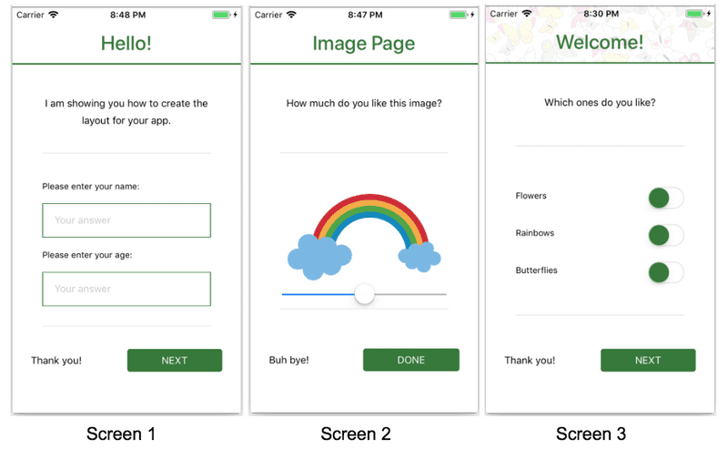
Let’s say our app is going to have 3 screens:
Step 1: Split your screen (screens) into main sections as below:
A. Header
B. Content
C. Footer
A. [Option 1]: Header - also known as Navigation Bar. This is a component that in most cases has to be permanently on the screen, helping the user to navigate through the app (it usually contains: screen title, back button, hamburger menu icon - to open the side menu or any other options, like filters).
B. Content (will be detailed later)
C. [Option 2]: Footer - also known as Tab Bar. In Android, though, usually the Tab Bar is under Header. The footer Tab Bar would be the second option, should have a fixed position on the screen, so that the user could have access to it all the time, similar to Header.
Step 1 for our app: In our app, we only have Header & Content. Let’s add this to our page templat
Note: I will not use react-navigation’s NavBar, I will create a custom component for Header.
Step 2: Create your page template by inserting the main components that you determined above.
// Page Template:

import React, { Component } from 'react';
import { View } from 'react-native';
import styled from 'styled-components/native';

const Wrapper = styled.View`
 width: 100%;
 height: 100%;
`

const Header = styled.View`
 height: 80px;
 width: 100%;
`

const Content = styled.View`
 flex: 1;
`

export default class Page extends Component {
 render() {
   return (
     <Wrapper>
       <Header/>

       <Content>
         {this.props.children}
       </Content>
     </Wrapper>
   );
 }
}

// Usage:

import React, { Component } from 'react';

import Page from '../templates/page';

export default class Hello extends Component {

 render() {
   return (
     <Page/>
   );
 }
}
Step 3: Select the appropriate styling for each of the section above.
1) Go through all of your screens (design screens).
2) Find the main similarities, starting from the margins.
Step 3 in our app - 1) & 2): We will add separate padding for both Header and Content.
Important note before we start: Android does not support ‘overflow: visible’. It is extremely important to be very careful with this, because sometimes you need to render a component that is out of its parents bounds. If you look into my designs, you can see that the NEXT button is not aligned to the right with the other components in the page. If we implement page template and page content in the wrong way (and put padding where it is not needed) we might be forced to render the NEXT button using negative margins. Unfortunately, on Android, the NEXT button will be cropped.
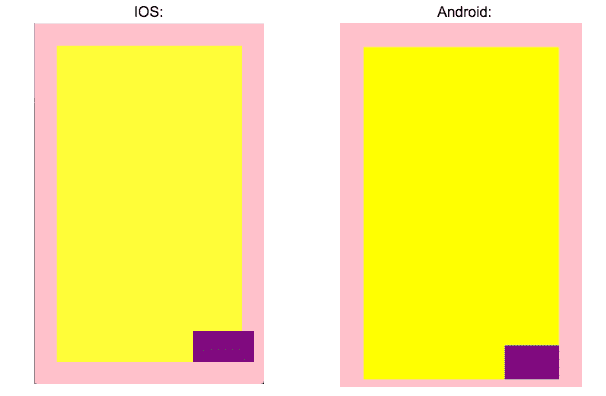
Example: We have 3 containers:
- Pink one: has padding: 36px;
- Yellow one: has flex: 1;
- Purple one: has height: 50px, width: 100px, margin-right: -20px;
As you can see, the purple box is cropped on android.
Step 3 for our app - (forwards) - The best thing that we can do to avoid this situation is to set the lowest padding possible that can be found in all the screens for that component.
- Header - has 16px padding;
- Content - has 32px padding-top, 32px padding-bottom, 32px padding-left but only 16px padding-right.
- Both of them (Header & Content) should have 16px padding.
import React, { Component } from 'react';
import { View } from 'react-native';
import styled from 'styled-components/native';

const Wrapper = styled.View`
 width: 100%;
 height: 100%;
`

const Header = styled.View`
 height: 80px;
 width: 100%;
`

[...]

const Content = styled.View`
 flex: 1;
 background-color: white;
 padding: 16px;
`

export default class Page extends Component {
 render() {
   return (
     <Wrapper>
       <Header>
         [...]
       </Header>

       <Content>
         {this.props.children}
       </Content>
     </Wrapper>
   );
 }
}
3) Establish your content type:
a. Sample View - use this ONLY when you are sure that your components will fit into the page no matter what (for example, if you have components with dimensions that are relative to the available space, like an image that fills 60% of the screen) - on any type of device.
b. Scroll View - use this if you have components that are not going to fit into the screen 100%, especially on smaller devices.
c. Keyboard Aware Scroll View - react-native-keyboard-aware-scroll-view is a library that handles the screen position when you have Text Inputs inside your page; it pushes up your Text Input components, above the keyboard, in order to allow your app’s users to have smooth interaction with the Text Inputs. (You can use whatever component / library you want, but I prefer this one. :) )
If the app is complex enough, it should have all the types of content described above. So we should include all of them in our app. Note: Do not place a Scrollable View inside the Content, but make the Content a Scrollable View, otherwise, if you include a ScrollView inside a View that has paddings, scroll bars will not be rendered correctly.
4) Include your content types into the page layout (don’t forget to make this customizable, using props)
import React, { Component } from 'react';
import { View, Platform } from 'react-native';
import styled from 'styled-components/native';
import { KeyboardAwareScrollView } from 'react-native-keyboard-aware-scroll-view';

const Wrapper = styled.View`
 width: 100%;
 height: 100%;
`

const Header = styled.View`
 height: 80px;
 width: 100%;
`

[...]
`

const Content = styled.View`
 flex: 1;
 background-color: white;
 padding: 16px;
`

const ScrollContent = styled.ScrollView`
 flex: 1;
 background-color: white;
 padding: 16px;
`

const HeaderComponent = () => (
 <Header>
   [...]
 </Header>
);


const PageContent = ({children}) => (
 <Content>
   {children}
 </Content>
);

const ScrollablePageContent = ({children}) => (
 <ScrollContent>
   {children}
 </ScrollContent>
);

const KeyboardAwareScrollablePageContent = ({children}) => {
 let containerStyle = {flexGrow: 1, padding: 16};

 return (
   <KeyboardAwareScrollView
     contentContainerStyle={containerStyle}
   >
     {children}
   </KeyboardAwareScrollView>
 );
};

export default class Page extends Component {
 constructor(props) {
   super(props);

   const { contentType } = this.props;
   let ContentTag;

   switch (contentType) {
     case 'view':
       ContentTag = PageContent;
       break;
     case 'scroll-view':
       ContentTag = ScrollablePageContent;
       break;
     case 'keyboard-aware-scroll-view':
       ContentTag = KeyboardAwareScrollablePageContent;
       break;
     default:
       ContentTag = PageContent;
   }

   this.state = {
     ContentTag
   }

 }
 render() {
   const { ContentTag } = this.state;

   return (
     <Wrapper>
       <HeaderComponent {...this.props} />

       <ContentTag {...this.props} />
     </Wrapper>
   );
 }
Quick and important note: If you’re using
- fastlane + react-native base, react-native-keyboard-aware-scroll-view will work just fine
-
for Expo.IO, remember to:
a) Add
"androidStatusBar": {
     "backgroundColor": "#fff"
    }
in app.json, otherwise your keyboard will keep covering the fields.b) Another catch for the keyboard in Expo is that you’ll have to add a Scroll View inside the Keyboard Aware Scroll View, otherwise, your keyboard will push your content up and compress your components!
5) Split your main components into smaller components.
Step 5 in our app: all our app’s pages have the same structure inside the Content section:
- Intro Section.
- Content Section.
- Submit Section.
If your Content has different layout for most of your screens, my advice is to skip step nr 5, but if you have only 2 or maybe 3 types of layout, I would add those if the page template too, adding the possibility to customize them.
Final thoughts:
Always start with the outermost element when establishing the padding. It’s true that sometimes you can make some tricks to fix those, but tricks sometimes lead to errors and complex spaghetti code.
Do not underestimate a simple design that needs to be implemented for cross platform and try to create the right template from the start.


